Responsive Browser Height
Download
View Demo
Free with subscription

Responsive Browser Height

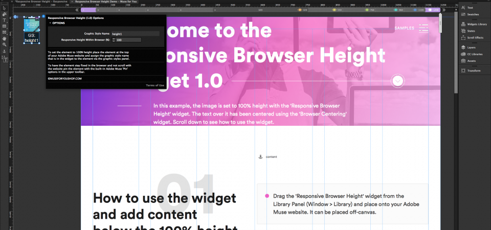
Set elements to be responsive in height with the Responsive Browser Height Widget.
Apply to any element

Apply to any element

Apply the responsive height to any element by applying the graphic style name to the element via the "Graphic Styles" panel in Adobe Muse. If applying to an image, the image must be within a rectangle.
Responsive-Ready

The widget works across all breakpoints and can be set to responsive width, responsive width and height, and stretch to browser width.

Multi-Browser Support

Google Chrome
Mozilla Firefox
Safari
Opera
Microsoft Edge
Internet Explorer IE 11+
Make Better Websites, Starting Today.

All access pass for only $49/year.